In 2006, researchers at Carleton University found that people form an opinion about a website’s visual appeal in as little as 50 milliseconds. That’s a twentieth of a second, faster than a single blink.
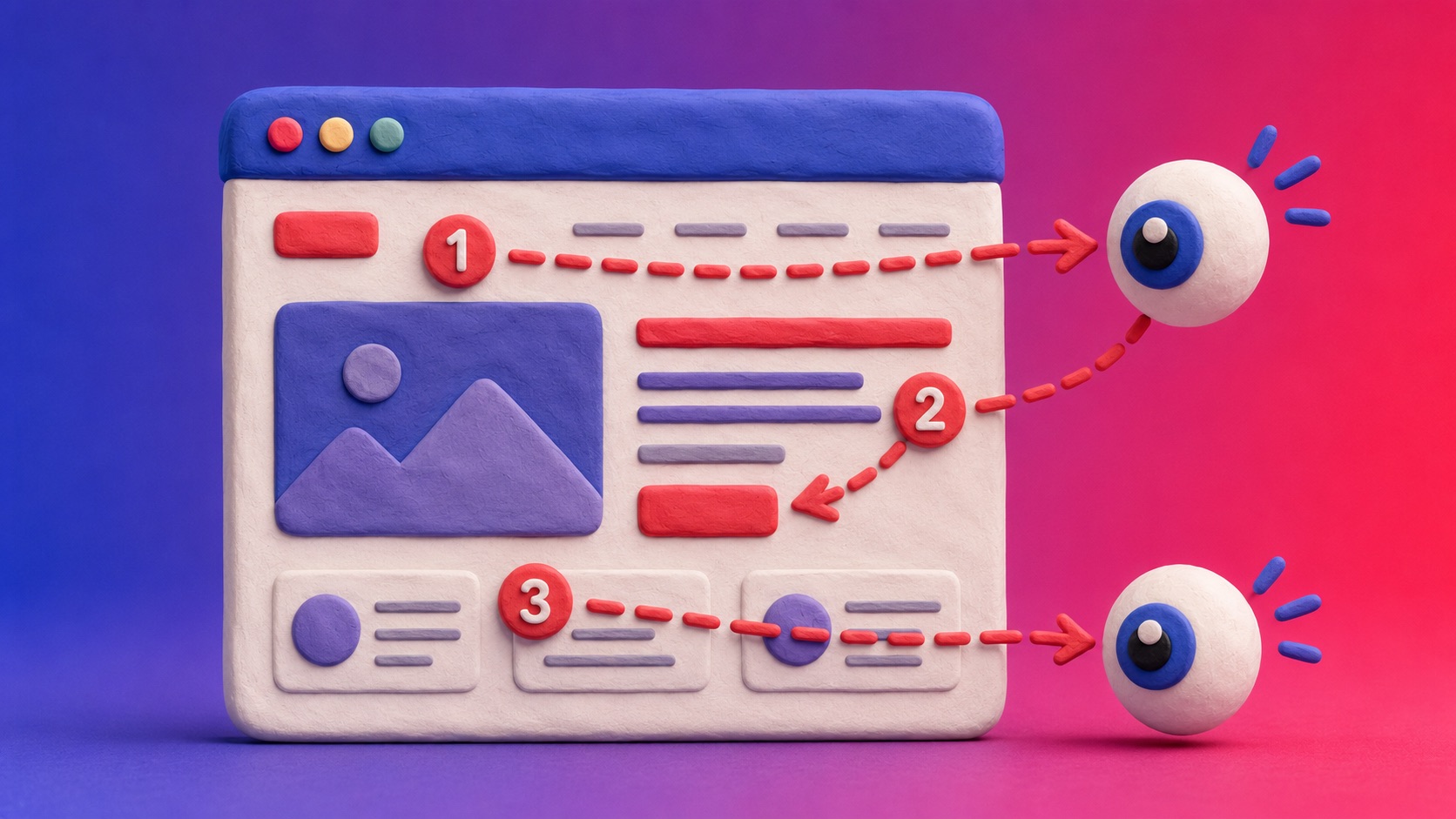
Nobody is consciously deciding anything in that instant. Their eyes are just moving across the page, and where those eyes land first quietly shapes everything that happens next. Designers call that path the eye trail.
What Is an Eye Trail?
An eye trail is simply the route someone’s eyes travel across a page in the first few seconds, before they’ve really started reading anything. It’s driven by instinct, not intention: bigger things, brighter things, and things placed in familiar spots pull attention first.
Good design doesn’t fight that instinct. It works with it, placing the most important information exactly where the eyes are already going to look.
The Two Patterns Most Pages Follow
Decades of eye-tracking research, much of it from the Nielsen Norman Group, have found that most eye trails fall into one of two shapes.
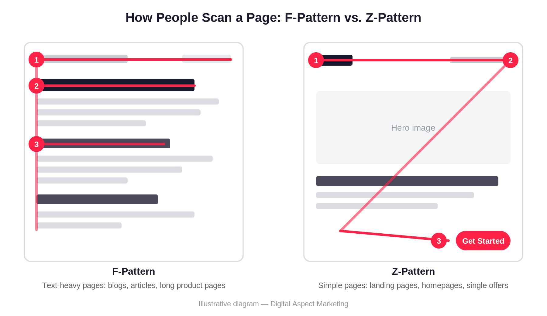
On text-heavy pages, like articles or long product descriptions, people scan in an F-pattern: a wide sweep across the top, a shorter sweep partway down, then a drift down the left edge as they skim headings and give up on full sentences.
On simpler pages, like homepages and landing pages, people follow more of a Z-pattern instead: left to right across the top, diagonally down across the middle, then left to right again at the bottom, often landing right on a button.
Anchors: The Points That Catch the Eye
Along that trail, certain elements grab attention and hold it for a moment before the eyes move on. Designers call these anchors.
An anchor can be a bold headline, a contrasting button color, a photo of a face, or simply a large empty space that makes everything around it stand out. The eye trail naturally snags on these points.
Placing an anchor in the wrong spot doesn’t just waste it. It can pull attention away from the thing you actually wanted someone to notice. A bright graphic beside your call to action should support it, not compete with it.
Above the Fold: Still Important, Just Not the Whole Story
The fold is an old newspaper term for the crease that only shows the top half of the front page on a newsstand. Online, it means whatever’s visible before someone scrolls.
Back in 2010, eye-tracking studies found people spent about 80 percent of their time looking at content above the fold. A 2018 update from the Nielsen Norman Group found that number had dropped to 57 percent, with 74 percent of attention landing within the first two full screens.
In other words, people scroll more than they used to. But that first screen still carries outsized weight, so it needs to say enough, and look good enough, to convince someone the rest of the page is worth their time.

Putting the Basics Together
None of this requires a redesign to start applying. A few basics go a long way:
- Put your strongest, clearest message at the very top, since that’s where every eye trail begins.
- Use one main anchor per section, usually a headline or button, so attention doesn’t scatter.
- Give your hero section real weight. It’s doing most of the work before anyone scrolls.
- Leave breathing room around anchors. A button surrounded by clutter is a lot easier to miss.
Why This Actually Matters
None of this is about making a page prettier. It’s about making sure the things you actually want someone to see, your value, your phone number, your call to action, land somewhere their eyes were always going to go anyway.
A page that fights the natural eye trail forces visitors to work for information they’d otherwise absorb in seconds. Most won’t bother. A page that works with it barely feels designed at all. It just feels easy.